Grid Components
Overview
Grids contain the components within the web portal necessary for modifying existing or new data, as well as more specific functionality of the individual screens within the web portal. It is important that the exact setup will vary screen by screen, but are still covered in this documentation's respective screen pages.
Panel Tools
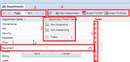
Grids are the main workhorse of the system. This is where you insert, update, and delete Records using (1) Row Editor. Grids allow you to sort and filter using the (2) Column Header Menu and page through lots of data using the (3) Paging Toolbar. Most grids have (4) Grid Toolbar Buttons to perform module commands. Not all columns are sortable or filterable. Some columns have icons which are called (4) Action Columns and have the ability to delete records, or shortcuts to quickly go to an associated screen. These are outlined and numbered in the screenshot below:

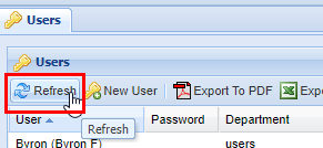
Refresh

| Top bar | The account management bar along the top of the window is used to change your password or logout. |
| Left panel | The navigation panel at the left of the screen is for navigating to different screens within the web portal. |
| Right panel | The content area, filling the majority of the window, will display information and tools based on the selected screen. |
Export to Excel or PDF
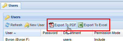
Almost all modules have the option to export the data shown to a table in PDF file format, or an Excel spreadsheet. Either click on Export to PDF or Export to Excel and it will start the download process. Depending on the browser settings, there may be a prompt to choose a location or it may download to a default destination such as the "downloads" folder. Consult the browser's documentation for more information.
Examples of data exports: PDF or Excel Spreadsheet.

Module Specific Buttons
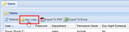
Almost all modules have buttons that are specific to their function. Such as the example below; the New User button is specific to the Users module.
Page Options
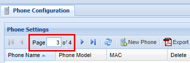
When dealing with large quantities of data, the platform automatically splits the entries into pages that can easily be navigated from the toolbar. In this example below, the page is on page 1 of the 4 possible pages available.
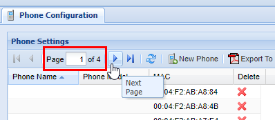
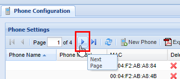
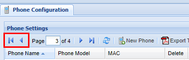
To move forward one page click the arrow to the right (If you hover over it, a tool-tip will pop up stating "Next Page.")
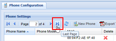
You can also skip to the last page by clicking the arrow to the right of the first arrow.
You can also move from page to page by simply typing the desired page number into the page indicator. 
Similar to moving forward one page and moving to the last page, you can conversely move back one page, or move to the first page.

Scroll Bar
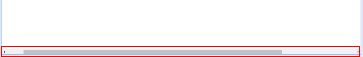
In some cases, it is necessary to use the scroll bar on the bottom of the page to navigate to the left or right to access certain settings within the Grids. Click and drag the bar to the left or right until you find the settings you wish to modify.

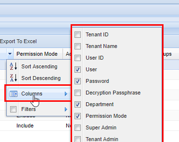
Additional Columns
Filter Function
Filters are a powerful method of sorting through a lot of data. Not every screen has lots of data, but on screens that do filtering is extremely useful. You can apply filters to multiple columns at once. Start by accessing the column header menu and click the Filters item. A pop-up will appear with a small pair of binoculars. Type your filter. Keep in mind that each filter is applied to each item individually. As you type, the grid will start to populate with data that the filter has found.

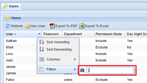
When finished, press enter or click out of the filter box.
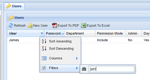

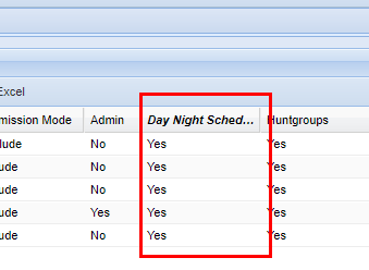
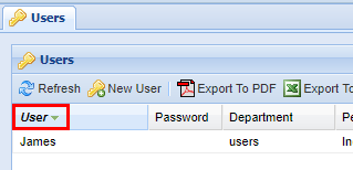
By typing "jam", the server finds the User named James. Columns that have an active filter on them will always be bold and italicized as shown below.
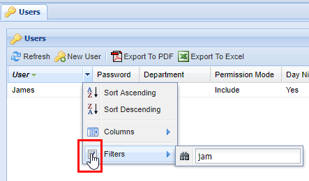
To deactivate the filter, click the column's header menu and then click the checkbox next to the filter option. Another option is to delete the text in the filter box. After you have done this, any filtered-out data will reappear:
Not all columns are text forms, some give the option such as yes or no as checkboxes:
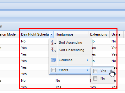
After checking yes for the filter column option, the grid will show all the rows where yes has been selected. The column's name becomes bold and italicized to indicate that a filter is active.