Web Portal Introduction
Row Editor
This page includes specifics on modifying data within the individual screens in the web portal.
Rows
Rows are the individual points of data that you can modify, view, or both. Within rows, there may be various options for editing the data, as well as dynamic or view-only options as well.

Drop Down Menu
When an option has multiple fixed values available, this will typically be displayed as a drop-down menu as shown below. To access the drop simply click on the box itself.
Fill Form
A fill form is a form where you enter the data yourself, depending on the form there may be no restrictions to space and characters, whereas others may require no spaces or special characters.
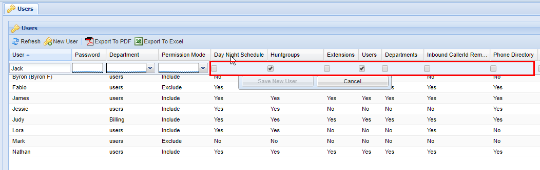
Checkboxes
Check boxes represent values that are essentially a yes or no (true or false) value. You simply click on the check box to check it or un-check it.
Editing Pre-Existing Entries
If you wish to edit a pre-existing entry within the web portal you simply need to click the row you wish to edit.
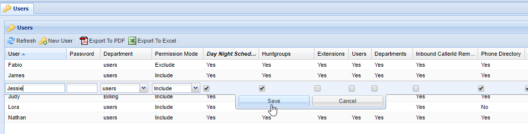
Form Validation
When editing or adding data in forms you will often notice at the bottom of the individual boxes that a squiggle line may span the entirety of the box. In the example below, you will see blue squiggles at the bottom of each box. This indicates that these fields are required.

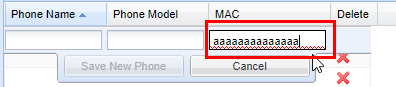
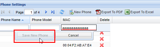
In the following example, you will see red squiggles in the field under the column MAC, this indicates that the entry submitted is invalid, and must be corrected. The web portal will not allow you to save until all fields with a red squiggle are corrected. 
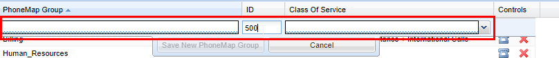
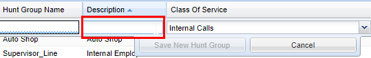
In the example below, you will see a field under the column Description without squiggles, this indicates that the field is optional and does not require an entry.
Since the MAC field is not valid, the web portal is smart and will not allow you to save data. The same goes for mandatory fields that have a blue squiggle underlining them. This is to prevent the saving of any invalid data that could potentially cause a system to not function properly.
Deleting data
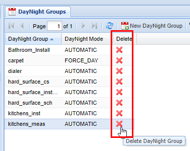
Generally speaking in almost all parts of the web portal you have the ability to delete individual data/records by clicking on a red X located on the far right-hand side of a screen (you may have to scroll) in an action column.
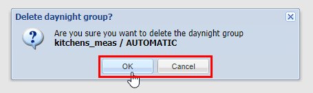
Whenever you delete data, a pop-up will appear graying out the web portal behind giving you the option to confirm, You will always see the option of OK, which will delete the entry and then save (followed by the Save Changes message), or Cancel, which will remove the pop-up and not change anything. It can always be assumed by clicking OK you are removing the data in question permanently, so when wondering about what things should be removed, contact your system administrator.
After clicking "OK", your data is permanently deleted.
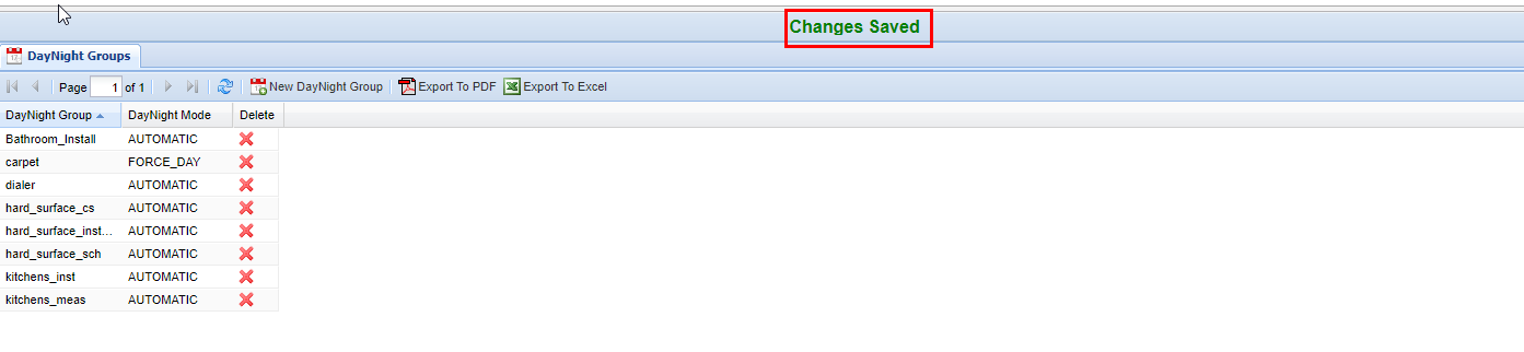
Saving Data
Anytime you complete an action such as inserting, updating, or deleting records, a green confirmation saying Changes Saved will always show if the settings have been saved successfully. This confirmation appears at the top center of the IntellaSoft Web Portal. If it doesn't display after a modification, double-check for errors and if you still have difficulties, consult with this documentation or lastly your system administrator for proper escalation.

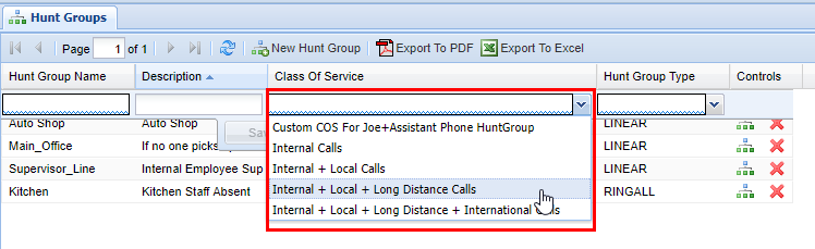
Class of Service
Throughout the web portal, you will see certain screens have a class of service value that must be selected. The class of service can be thought of as a security feature. Currently, the following screens have this value:
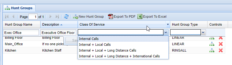

A Class of Service defines what numbers an associated group can call. It is possible to set up specific classes of service to handle specific numbers. By default, most Intellasoft installations will come with 4 default classes of service.
| Class of Service |
Description |
| Internal Calls | Can call internal extensions only. |
| Internal + Local Calls | Same as above but can additionally call numbers with a local area code. |
| Internal + Local + Long Distance Calls | Same as above but can additionally call numbers that are long distance (non-local area code). |
| International + Local + Long Distance + International Calls | Same as above but can additionally call numbers that are internationally based. |
Additional options are available for creating classes of services, but you will need to contact your system administrator/IntellaSoft representative for options on configuring this. It is important to note that the class of service applies to calls that are being transferred from the extension/group that the class of service applies to. There are also options for blocking certain calls at the forefront without them gaining access to the phone system such as the IVR (Interactive Voice Response), live agents, individual extensions, etc.
Overview
This section covers the core basics of the web portal. If this is your first time using the web portal, start by getting familiar with logging in, basic navigation and account management in the Top Level Interface Components section. Afterward, familiarize yourself with the Grid Components layout/editing capability and, lastly, how to change data using the Row Editor.
Pages within the Web Portal Introduction:
- Top Level Interface Components - This section includes the absolute minimums of the web portal. You can start by navigating to your organization's URL. This web address will be given to you by your company's system administrator or an Intellasoft representative.
- Grid Components - Grids contain web portal components for modifying existing data or adding new company-specific information. Although the exact information displayed in web portal examples will vary from your displayed screen, the general technique for adding/changing information will still be covered in this documentation's respective screen pages.
- Row Editor - Modify data within any displayed row on the web portal by using standard widgets.
- Class of Service - Outgoing call permissions can be assigned for hunt groups, extensions, and phone map groups using the web portal screens.
Documentation Formatting
For the purposes of this handbook anytime a specific feature (such as a button, tab, screen, module, etc.) is specified in the guide it will be in a capitalized Bold Face. The red boxes outlining anything within the web portal indicate areas of attention.
Overview Components
Overview
This section includes the absolute minimums of the web portal. You can start by navigating to your organization's URL which will be given to you by your system administrator or Intellasoft representative. Afterwards you will see a login screen. Start by following the instructions below to get familiar with the platform.
Logging In

Top Level Interface Components

 |
 |
| Top bar | The account management bar along the top of the window is used to change your password or logout. |
| Left panel | The navigation panel at the left of the screen is for navigating to different screens within the web portal. |
| Right panel | The content area, filling the majority of the window, will display information and tools based on the selected screen. |
My Account

To change the account password, click on the My Account menu located at the top left corner. Next click the Change password for my account: <username> button.
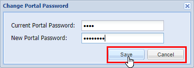
Within the popup, enter your Current Portal Password and New Portal Password. Click Save and there will be a confirmation of Success - Saved password or Invalid current password if the current portal password is incorrect. Click OK to continue.
Logout
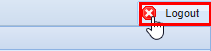
Closing the browser is not enough to be logged out since the Intellasoft Web Portal uses cookies. Remaining idle for an extended period of time may not do the trick either, depending on the specific timeout settings. The best way to logout is to use the Logout button in the upper right-hand corner.
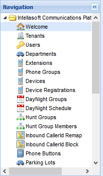
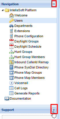
Navigation
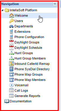
The red box panel on the left is the Navigation. From here you are able to select the various Screens (also called Modules) within the IntellaSoft platform. To select a specific Screen, click on the name you want to access. The subtle difference between Screen and Module is that the screen is the visual component of the exact module on the server. Note that a module may provide features across multiple screens. Anytime the documentation refers to navigating to a screen or module refer to the navigation panel and click the screens' respective name. You will see it highlighted in blue indicating which screen you are currently in.
Screen Content Area

The red box panel on the right is the Screen Content Area which is a Tab Panel. The title of the Screen will be in the tab name.
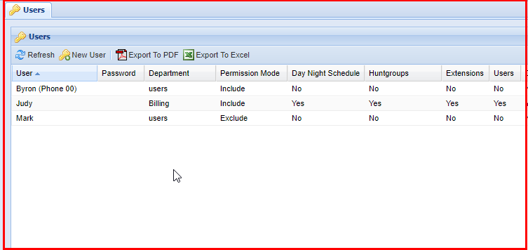
Screens
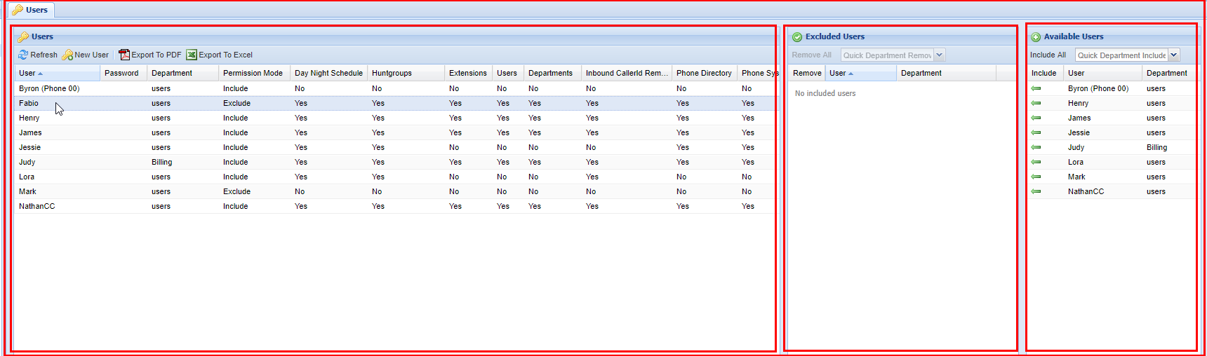
In this example, we have selected the Users Screen. Notice that Users is highlighted within the Navigation Panel. The Screen Content Area now contains the specific Panels for the screen. In this case, the four smaller Panels are all Grid Panels.
Panel Sizer Bar
You have the option to resize individual panels within each screen. To do this simply click on the in-between space between panels and drag in the direction to want to resize. Afterwards the panel will be extended right, the opposite works when trying to resize panels to a smaller amount. You can also do this to the height of panels as well.


Panel Tools

Currently, there are not very many Panel Tools implemented, but an example of a Panel Tool is the option to collapse or expand panels, to provide a better view of other Panels. See the example above.
Group Selection
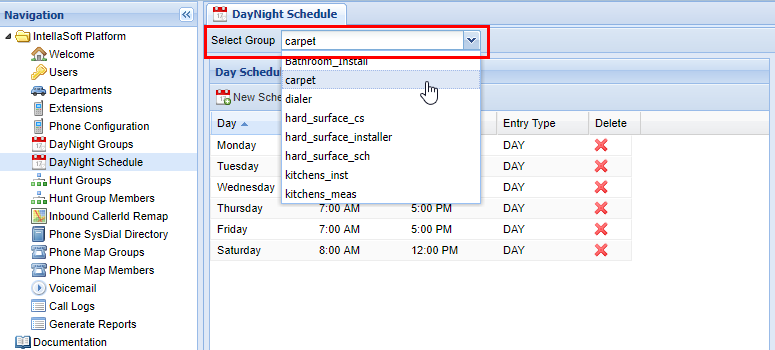
When using some screens such as DayNight Schedule or even Voicemail it is important to note that you have chosen the correct group to modify. This can be done with the Select XXXX (XXXX will depend on the exact screen you are in) function which is located at the top left-hand of the screen.
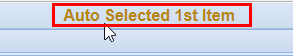
If you are selecting this screen for the first time since logging in, you will also see a brief message such as the one below indicating that it has auto-selected the 1st group that would be included in the drop-down menu for Select XXXX. This is simply to bring attention to the fact that you may have to change the group to modify the one in question.
Grid Components
Overview
Grids contain the components within the web portal necessary for modifying existing or new data, as well as more specific functionality of the individual screens within the web portal. It is important that the exact setup will vary screen by screen, but are still covered in this documentation's respective screen pages.
Panel Tools
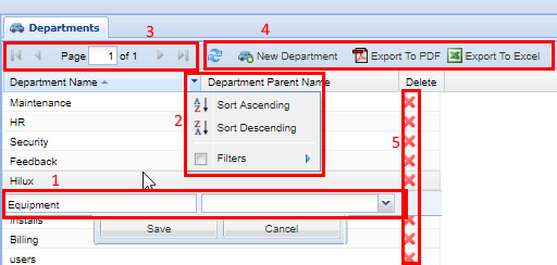
Grids are the main workhorse of the system. This is where you insert, update, and delete Records using (1) Row Editor. Grids allow you to sort and filter using the (2) Column Header Menu and page through lots of data using the (3) Paging Toolbar. Most grids have (4) Grid Toolbar Buttons to perform module commands. Not all columns are sortable or filterable. Some columns have icons which are called (4) Action Columns and have the ability to delete records, or shortcuts to quickly go to an associated screen. These are outlined and numbered in the screenshot below:
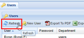
Refresh

| Top bar | The account management bar along the top of the window is used to change your password or logout. |
| Left panel | The navigation panel at the left of the screen is for navigating to different screens within the web portal. |
| Right panel | The content area, filling the majority of the window, will display information and tools based on the selected screen. |
Export to Excel or PDF
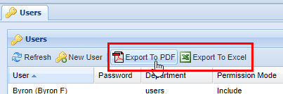
Almost all modules have the option to export the data shown to a table in PDF file format, or an Excel spreadsheet. Either click on Export to PDF or Export to Excel and it will start the download process. Depending on the browser settings, there may be a prompt to choose a location or it may download to a default destination such as the "downloads" folder. Consult the browser's documentation for more information.
Examples of data exports: PDF or Excel Spreadsheet.
Module Specific Buttons
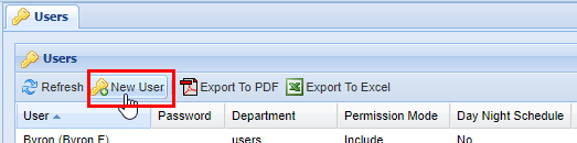
Almost all modules have buttons that are specific to their function. Such as the example below; the New User button is specific to the Users module.
Page Options
When dealing with large quantities of data, the platform automatically splits the entries into pages that can easily be navigated from the toolbar. In this example below, the page is on page 1 of the 4 possible pages available.
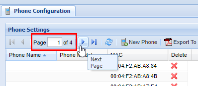
To move forward one page click the arrow to the right (If you hover over it, a tool-tip will pop up stating "Next Page.")
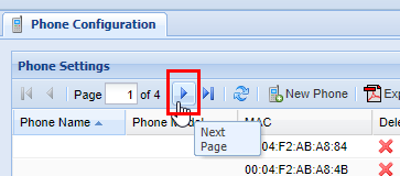
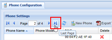
You can also skip to the last page by clicking the arrow to the right of the first arrow.
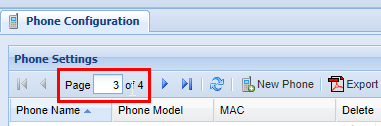
You can also move from page to page by simply typing the desired page number into the page indicator. 
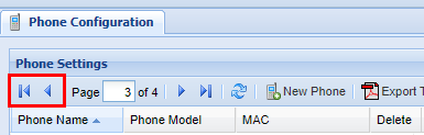
Similar to moving forward one page and moving to the last page, you can conversely move back one page, or move to the first page.
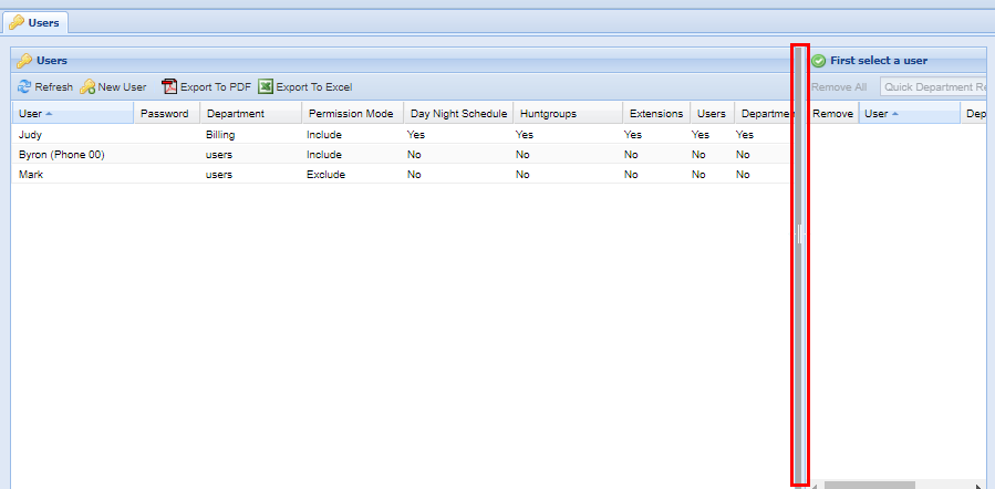
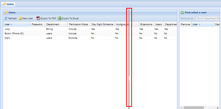
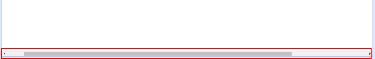
Scroll Bar
In some cases, it is necessary to use the scroll bar on the bottom of the page to navigate to the left or right to access certain settings within the Grids. Click and drag the bar to the left or right until you find the settings you wish to modify.
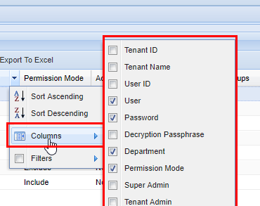
Additional Columns
Filter Function
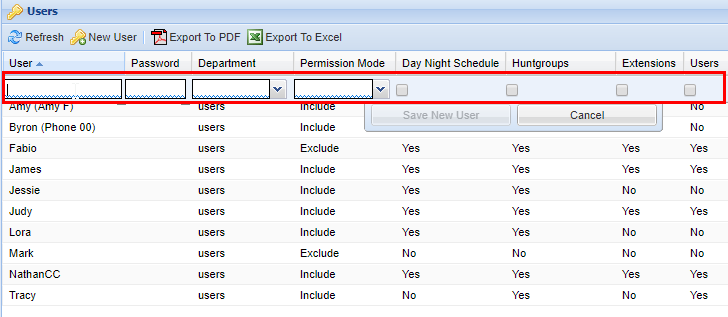
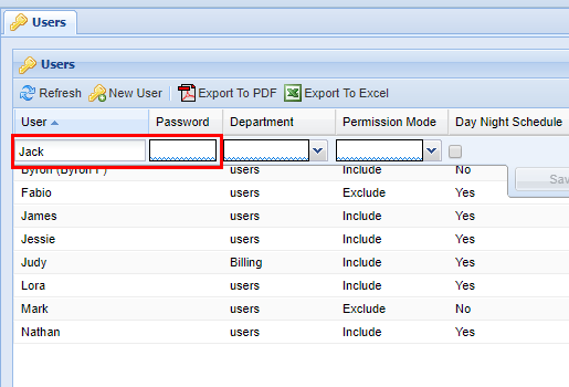
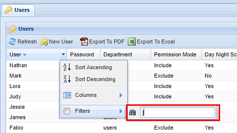
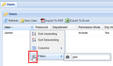
Filters are a powerful method of sorting through a lot of data. Not every screen has lots of data, but on screens that do filtering is extremely useful. You can apply filters to multiple columns at once. Start by accessing the column header menu and click the Filters item. A pop-up will appear with a small pair of binoculars. Type your filter. Keep in mind that each filter is applied to each item individually. As you type, the grid will start to populate with data that the filter has found. 
When finished, press enter or click out of the filter box.
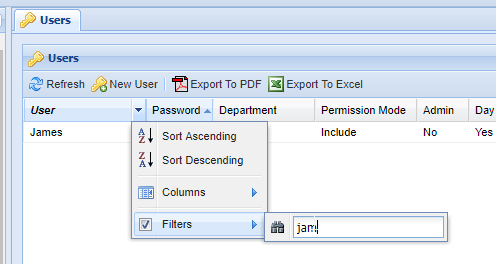
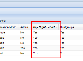
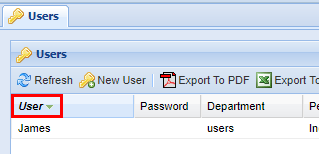
By typing "jam", the server finds the User named James. Columns that have an active filter on them will always be bold and italicized as shown below.
To deactivate the filter, click the column's header menu and then click the checkbox next to the filter option. Another option is to delete the text in the filter box. After you have done this, any filtered-out data will reappear:
Not all columns are text forms, some give the option such as yes or no as checkboxes:
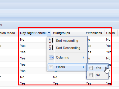
After checking yes for the filter column option, the grid will show all the rows where yes has been selected. The column's name becomes bold and italicized to indicate that a filter is active.